29/71
Brand/Art Direction/Website Design & Build
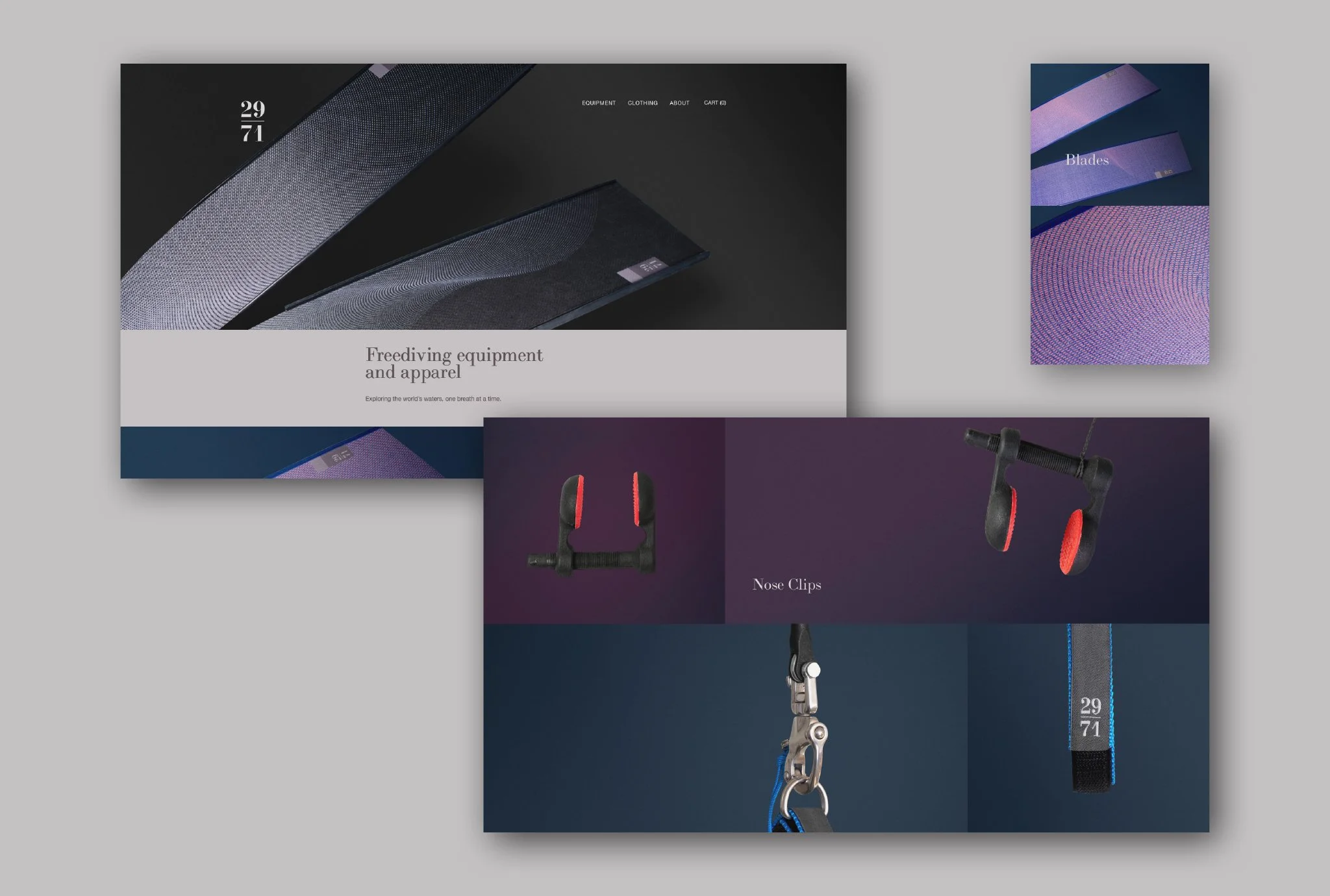
Brand identity for freediving company 29/71 . We have been responsible for creating all aspects of the brand including naming, copy writing, art-direction, graphic design and web design. We have also been involved in the product design.
The name represents the earth’s ratio of land to water. Suggestive of the vast proportion of the world that can be explored by diving, whilst at the same time serving as a reminder that freediving is a holistic sport and that what you do on land, in terms of breathing exercises, diet, stretching etc, will improve your experience in the water. To reinforce this message, a two tone block device with a 29/71 split was implemented across the brand, in particular on all product labels.
View the site here.
Product Design and Art Direction
—
Alongside the branding, we worked with 29/71 to develop the surface design and in some cases elements of the product design.
We developed a unique printing technique for the blades that allows the design to be printed directly on to the carbon fibre. The print becomes an integral part of the material and allows the resin to flow through the fabric during the curing process, avoiding any reduction in performance. The print is also perfectly preserved and protected.
The noseclips and lanyard sleeves are 3D printed and both have logos embossed into the material.
Our Story So Far
—
Design of a review of the company’s product range, diver achievements and plans for future launches.
Website
—
Design, build and product photography for 29/71’s e-commerce website.
Related Projects
29/71: Website
Orriss & Son


